
NWSL’s Boston Legacy FC Puts the City First in Secondary Kit
Here's my review of the team's Common Ground secondary kit. Plus, my take on the league's 2026 prematch top.

I wanted something uniquely Boston. And we got it. ⚽
Introducing Boston Legacy’s secondary kit: Common Ground.
At first glance, it might just look like random neon color splotches. But those splotches, along with the inverse black spaces, are actually the shapes of Boston’s neighborhoods.
“23 neighborhoods. One Common Ground. This is more than a kit. It’s the city we play for,” the introductory post said.
The puzzle design, as well as the name Common Ground, speak for soccer bringing communities together. The name is also a nod to the Boston Common, the city’s historic park.
The team is pairing the launch with a series called the Common Ground Chronicles where throughout the season, it’ll highlight people and community work from the city’s neighborhoods.
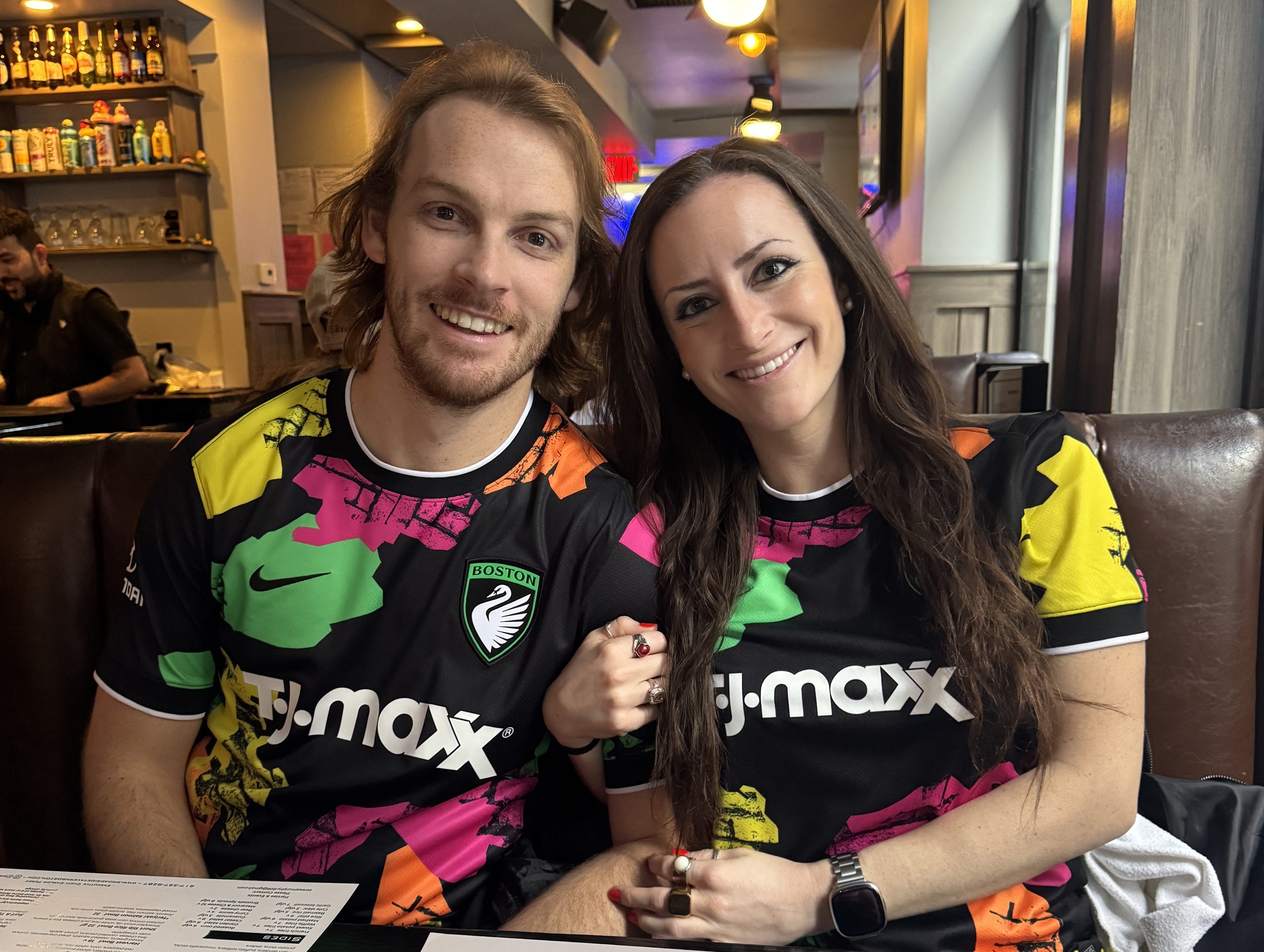
At first glance at the Common Ground kit, I knew I loved the use of all the vibrant colors: Fuchsia Flash, Legacy Green, Dynamic Yellow, and Cone Orange. And best of all, it called back to one of my requests.
Before the launch of the First Light kit, I wrote an article on what I’d like to see from the reveals. My No. 1 want was a jersey similar to Chelsea’s 2024/25 third kit that celebrates the history of punk in London, as well as women’s soccer, with bright pink and yellow.
In a side-by-side comparison, it’s safe to say the colors juxtaposed to black backdrops on both jerseys have a similar effect.
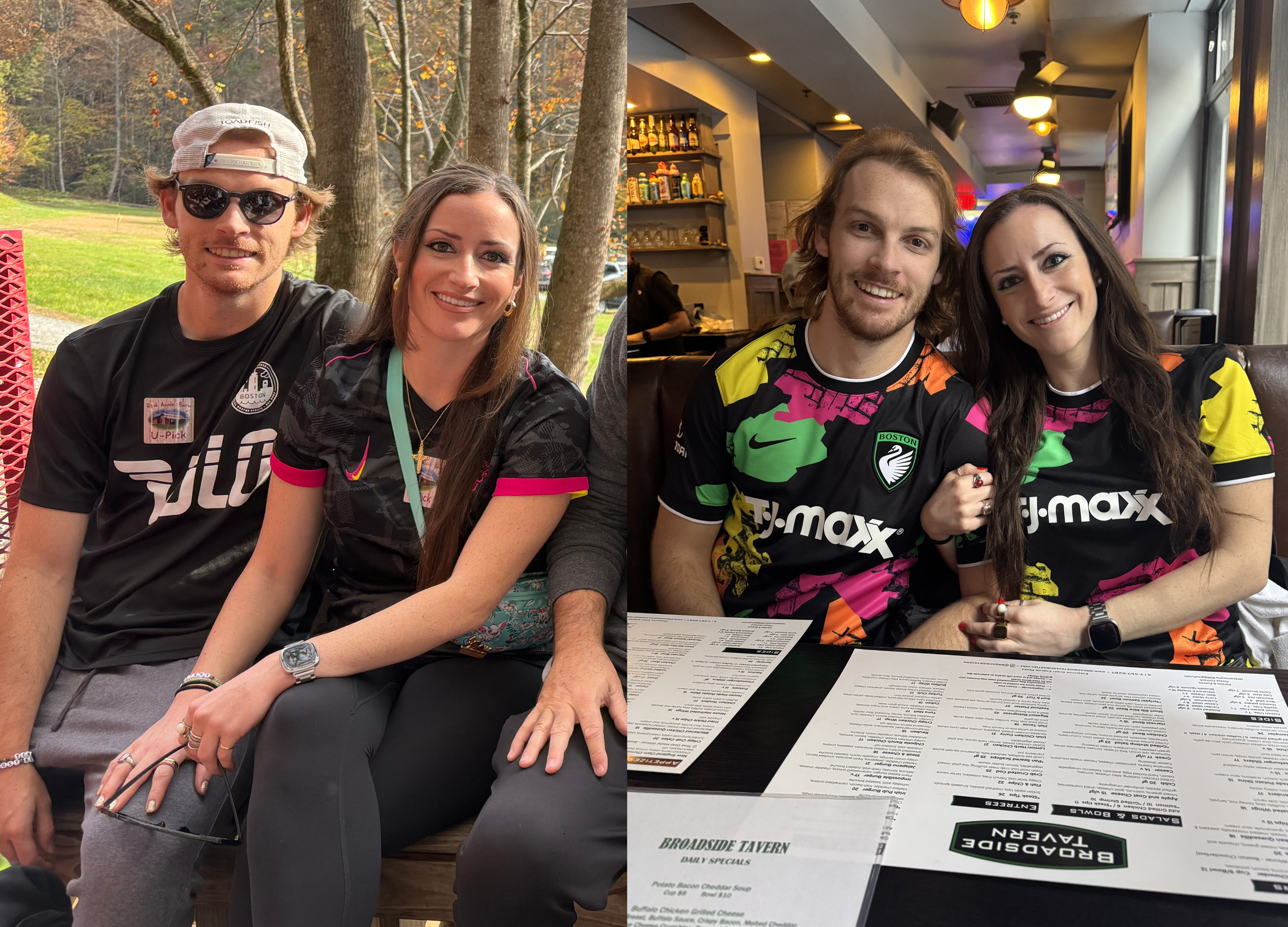
Last week, my partner and I bought the Common Ground jersey at the Legacy’s kit celebration party, and the colors look even better in person.
We walked around the city this weekend in our matching Common Ground kits, and it was a statement that definitely drew intrigued looks, which is exactly the kind of curiosity you want to drum up with the launch of a new team.
The jersey also features a high-quality Legacy crest patch on the chest and a 26 emblem on the bottom to acknowledge the inaugural season.
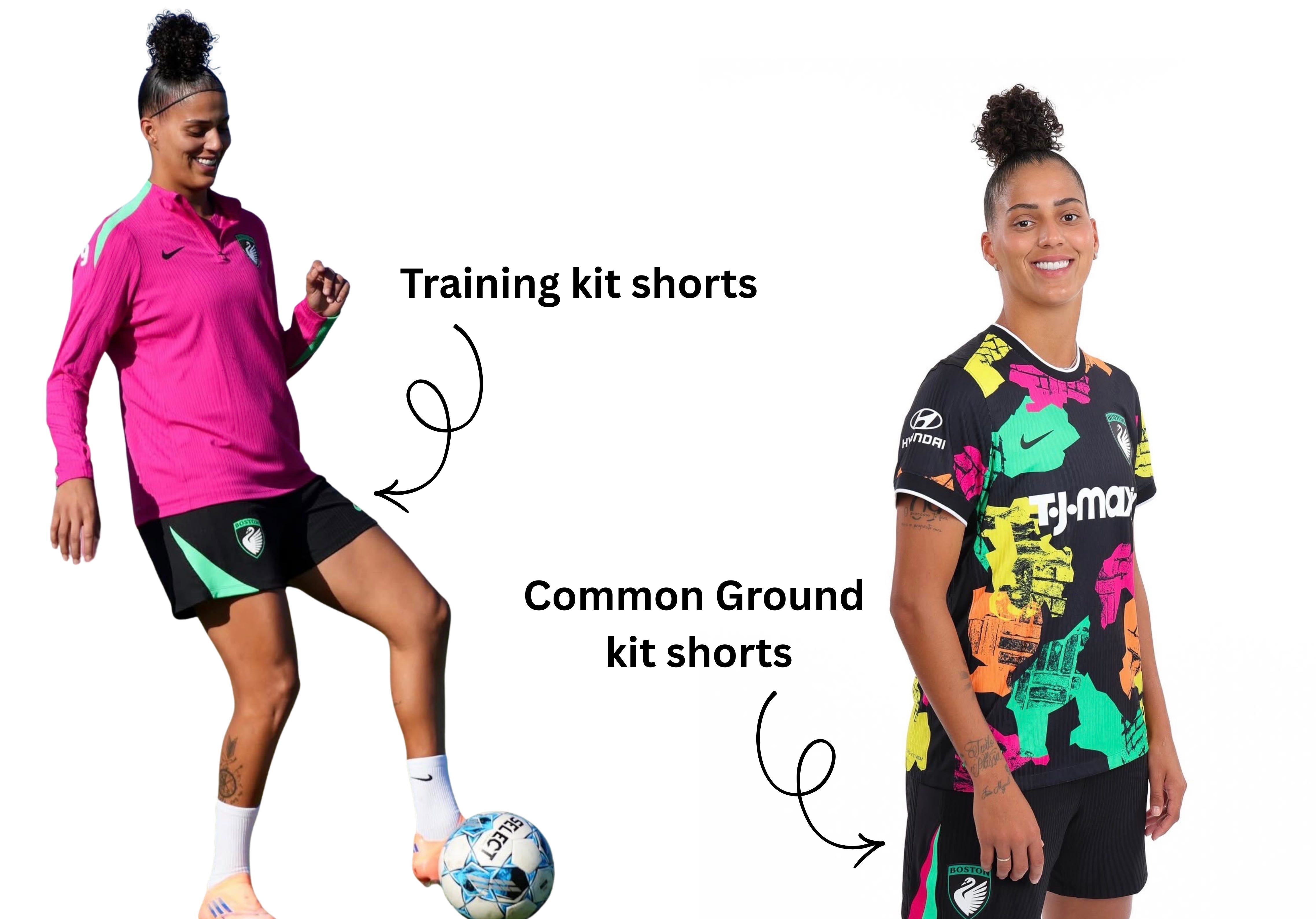
While I love the jersey, I’m not as enthusiastic about the kit’s shorts.
The pink and green triangular stripes down the side of the shorts are missing either a yellow or orange stripe and the lower hem should have featured a white line like on the neckline of the jersey to visually pair the top and bottom.
Without these details seamlessly transitioning the pieces of the kit, it feels like the team is wearing its training shorts versus a custom game look.
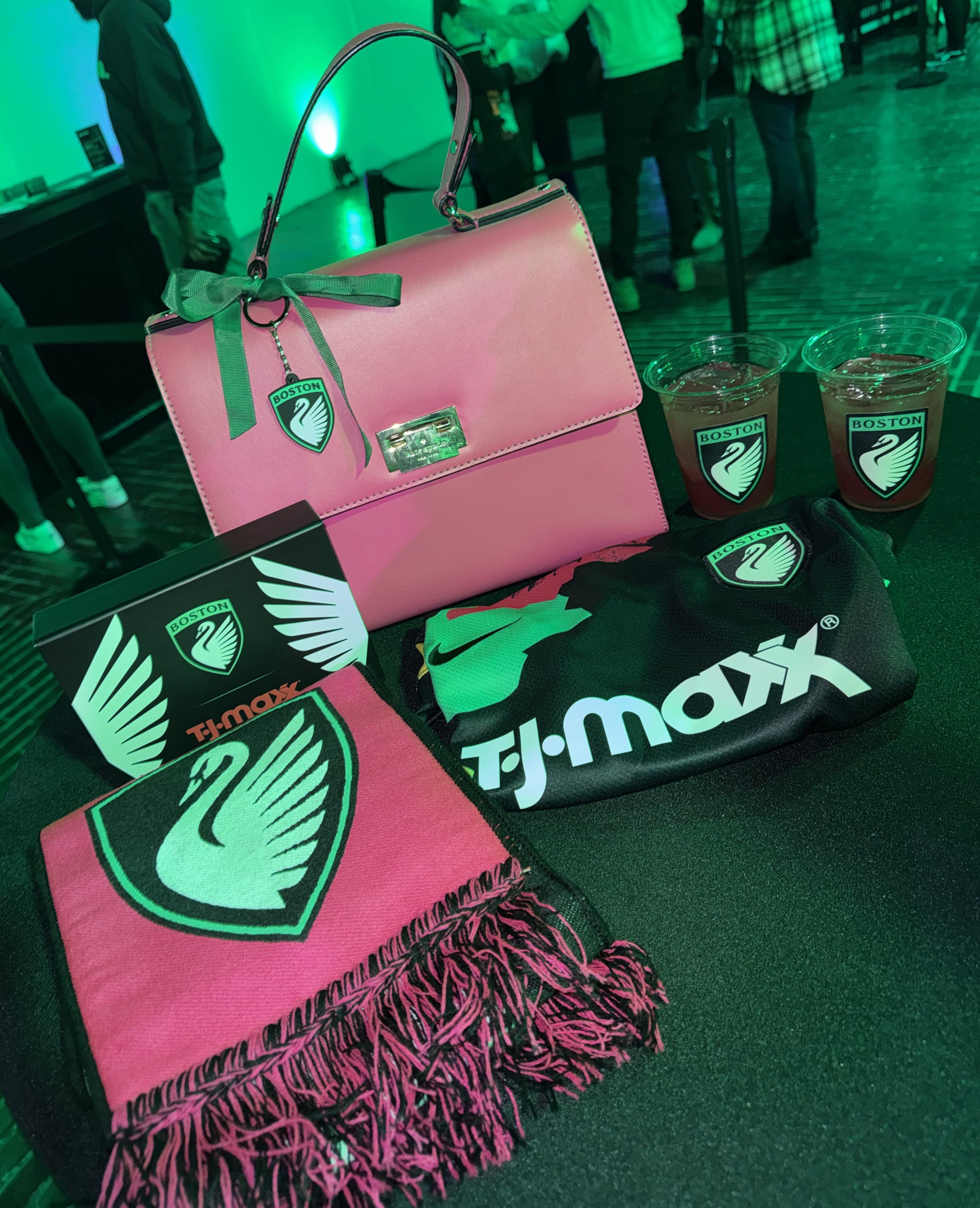
The Legacy won’t have a third kit this season, but they did also release their prematch top that uses a bright color palette of orange and pink on black.
The streetwear-inspired design features rock-like graphics for the stone’s grounding qualities and as a statement that the NWSL is “solid as a rock” in its 14th year.
The shirt is also speckled with large graphic dots with each tile of fabric containing 16 dots, representing the 16 teams in the NWSL.
No matter how many times I look at it, the dots feel incredibly random. And since the 16 dots are on each tile of fabric, not each shirt, each jersey isn’t guaranteed to have all 16 teams represented.
While I love the symbolism, the pattern is still just dots and rocks. There had to be another way to evoke the same message about the NWSL. At least all the NWSL teams are in the same boat and have dotted pre-match shirts to rock together.
Last week, the other NWSL teams also released their new kits. From cherry blossoms for the Washington Spirit to the original Houston Chronicle building for the Houston Dash, the NWSL is ready to fashionably start the 2026 season.
Catch up on more Boston Legacy FC coverage below: